13 Genius Ways To Fix Your Chaotic iPhone (And Make It Aesthetic)
This post is about how to make your iPhone feel less chaotic with simple layout rules.
If your iPhone feels chaotic, cluttered, or visually loud, it’s probably not the apps. It’s the layout. A clean, aesthetic phone isn’t about having the cutest widgets or the trendiest icons. It’s about following a few simple layout rules that instantly make everything look intentional, calm, and cohesive.
These are the iPhone layout rules I follow to keep my home screen clean, minimal, and pretty (without overcomplicating it). Let’s fix the chaos!
iPhone Layout Rules For An Aesthetic & Organized Phone
#1: The Weekly Use Rule
If you don’t use an app weekly, it doesn’t belong on your main home screen. Removing rarely used apps reduces visual clutter and keeps your layout intentional. The App Library exists for a reason, after all!
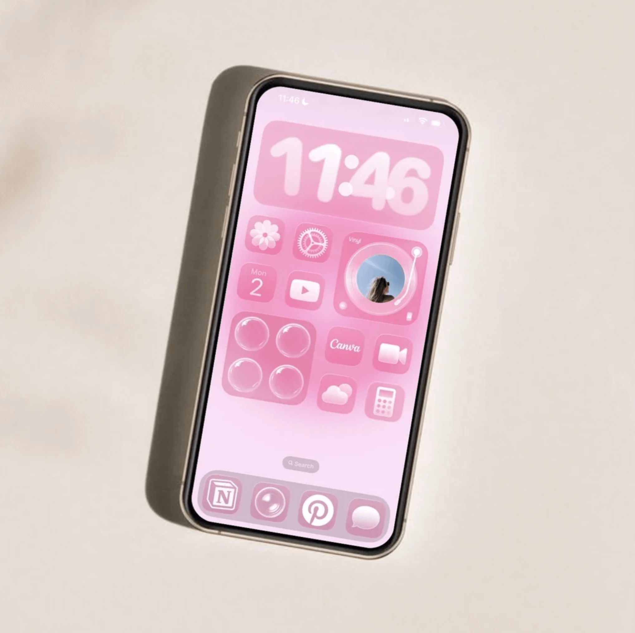
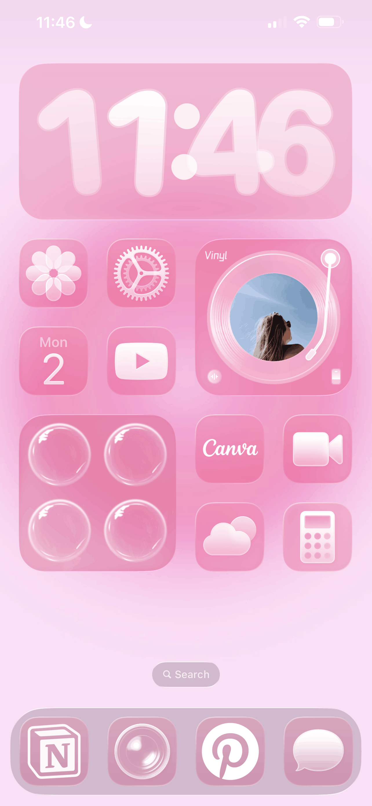
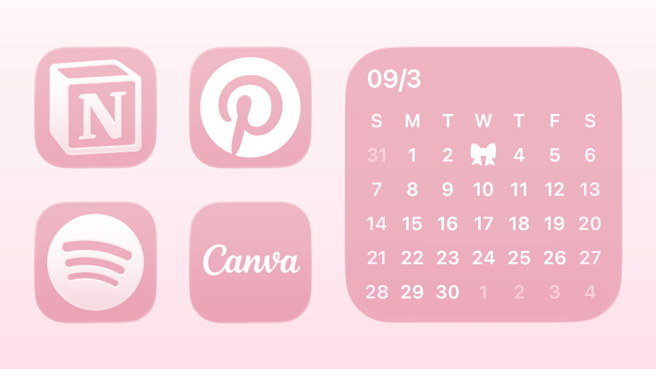
#2: The Color Cohesion Rule
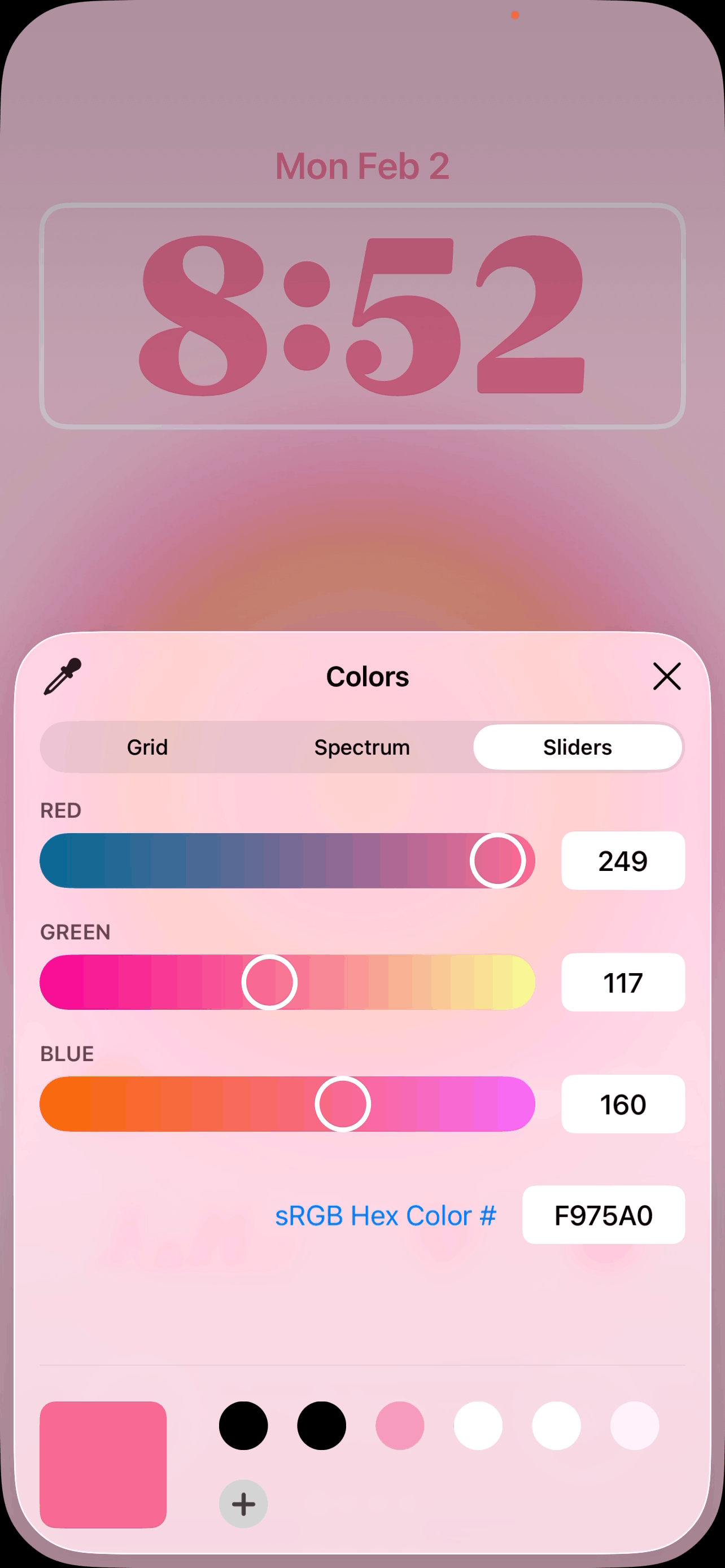
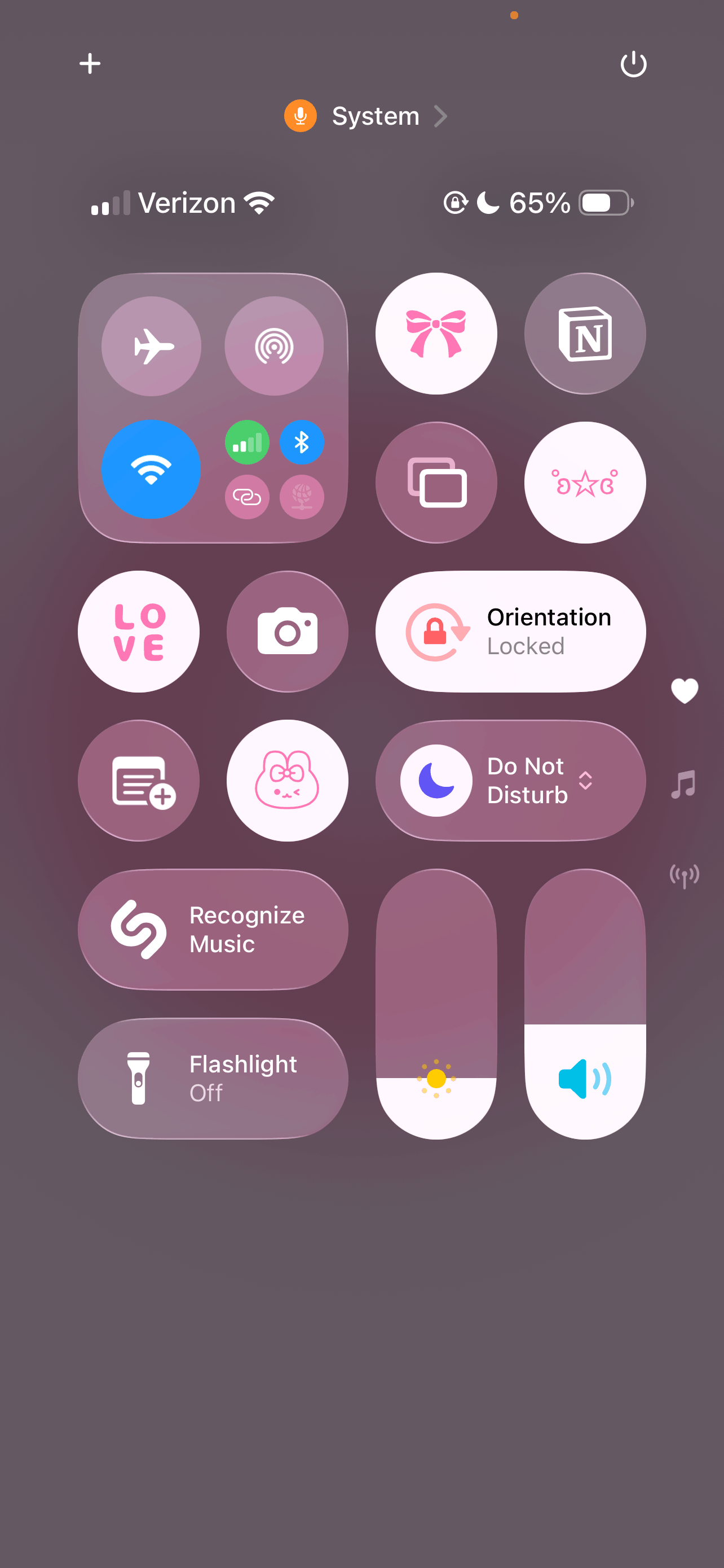
A stress-free iPhone setup works best when you choose one clear visual theme. Neutral tones, soft pink, dark mode, or a seasonal palette all work beautifully. Mixing too many colors breaks the visual flow and instantly makes your home screen look busy. My usual rule? Pick one main color and one to two accents max.
#3: The Dock Discipline Rule
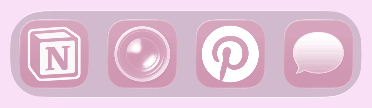
Your dock should hold your most essential and commonly used apps. Having your favorite apps within easy reach at all times is one of my best tips for making using your phone a stress-free and seamless experience. Well, as stress-free as possible at least.
Related: How To Customize Your iPhone With iOS 26 (Aesthetic Pink Aura Theme + Tutorial!)
#4: The Matching Lock Screen Rule
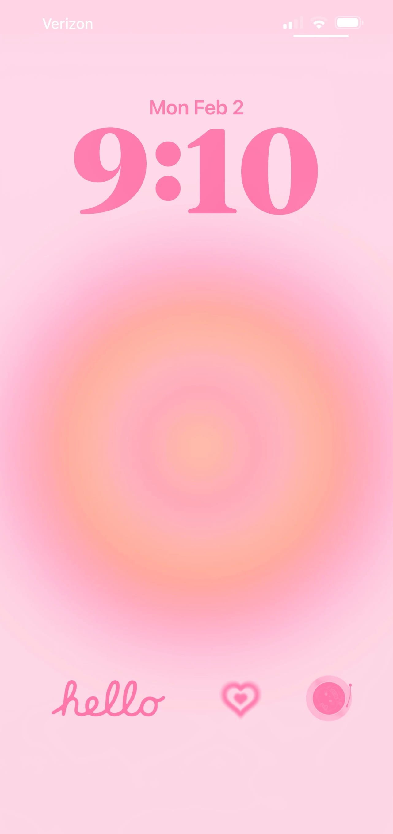
If you really want to minimize the chaos, try making your lock screen and home screen feel cohesive. Matching colors, tones, or overall mood creates a seamless experience. For example, a soft neutral lock screen paired with a bright chaotic home screen breaks the aesthetic flow.
Related video:
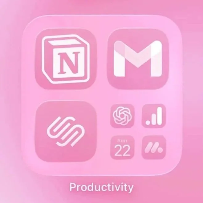
#5: The Category Clarity Rule
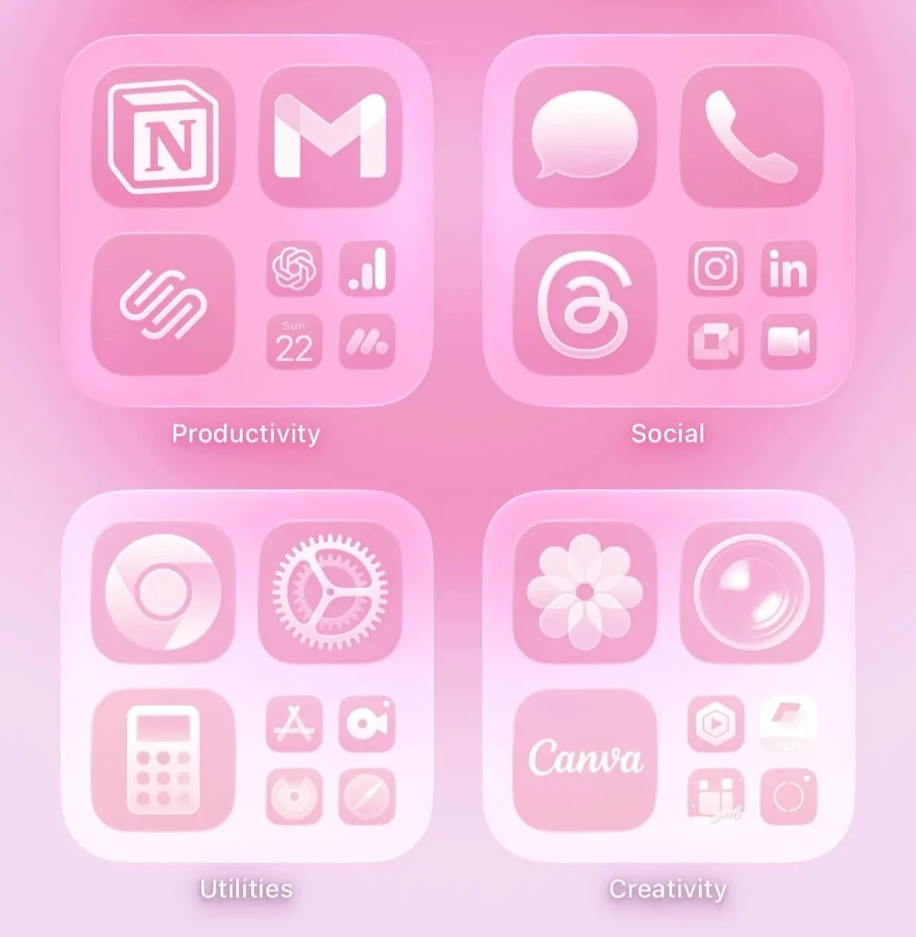
If you use folders, make sure each one has a clear category. Avoid vague folder names like “stuff” or “other.” Clear categories make your home screen feel intentional rather than messy. Some folder ideas are social media, finance, work, communication, creative, health, planning, etc.
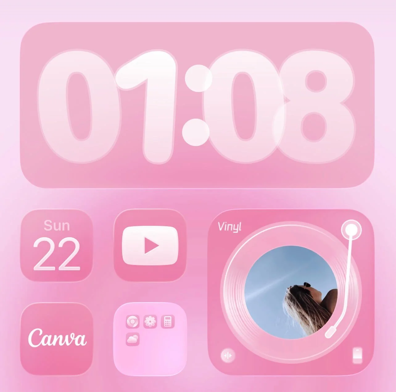
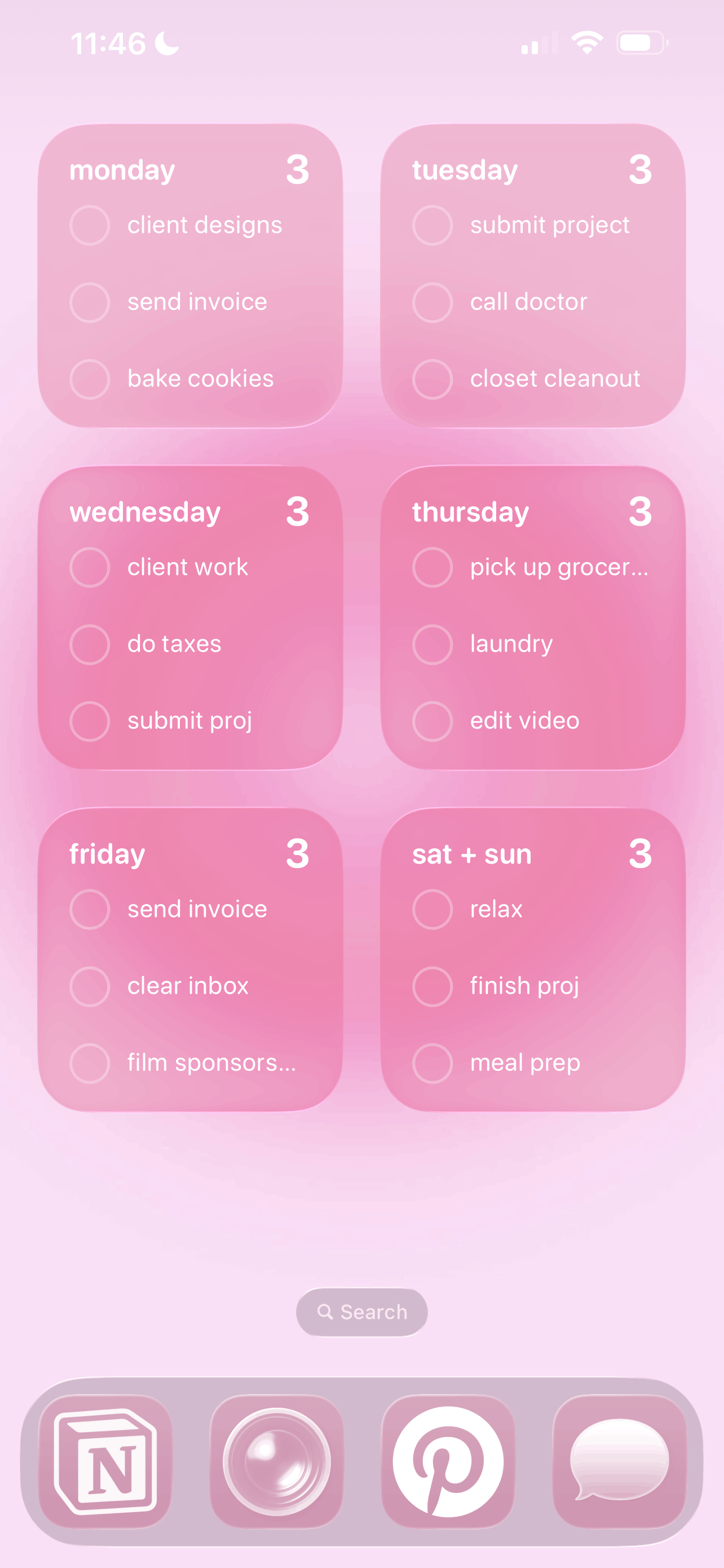
#6: The Consistent Grid Rule
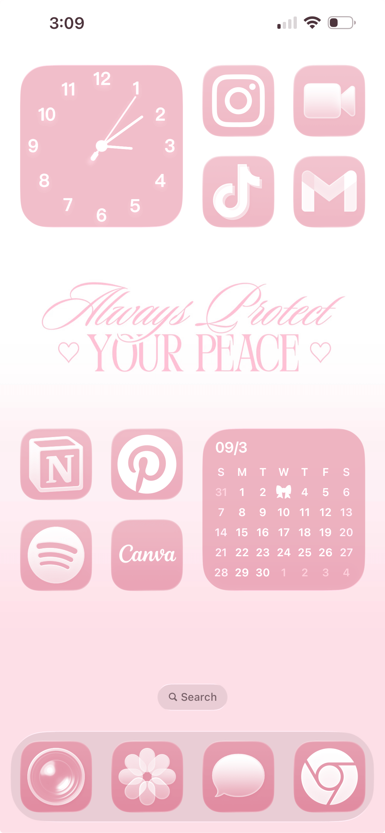
No more randomly places apps and widgets! When possible, keep apps aligned in clean rows or another intentional layout. Avoid awkward half-filled sections that look accidental. You can never go wrong with a structured grid layout, and they always naturally feel more minimal and elevated.
#7: The Negative Space Rule
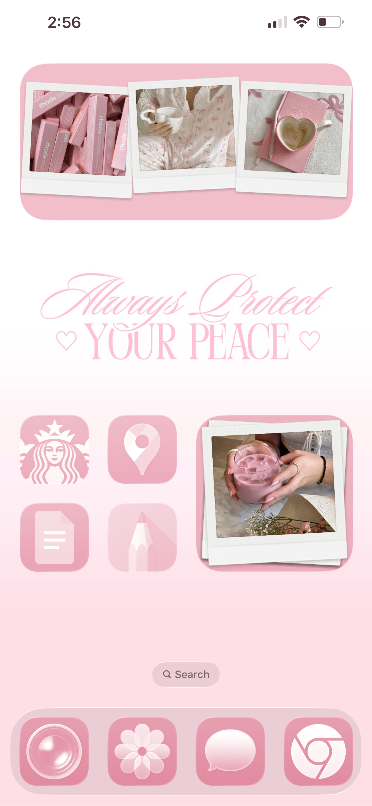
One of the biggest secrets to a clean iPhone layout is empty space. Breathing room, my friends! Not every app slot needs to be filled. Allowing space between icons creates a clean and minimalist feel (which is much needed when your digital life feels as hectic and fast-paced as mine).
#8: The Thumb Reach Rule
This next one is so underrated! Place your most-used apps where your thumb naturally rests. If you constantly have to stretch across your screen, your layout isn’t optimized. A clean iPhone setup isn’t just about how it looks. It should feel effortless to use, too.
Related: 40 Totally FREE Aesthetic iPhone Widgets You’ll OBSESS Over!
#9: The Folder Limit Rule
Folders are helpful, but too many can create visual overwhelm. Keep folders to a minimum and only group apps that truly belong together. Overloading your screen with all those tiny folders makes it feel busy and cluttered instead of clean and organized.
#10: The Notification Clean-Up Rule
No aesthetic iPhone layout needs excessive notification badges. Seeing “27” or “143” every time I unlock my phone creates a subtle sense of urgency that I’d rather not have, personally. Plus, my phone looks a lot cuter and cleaner without them.
Turn them off by going to settings > notifications > select the app > turn off badges for anything that doesn’t truly need your attention. If you want, you can keep badges for essentials (like messages), and remove them everywhere else.
#11: The Page Limit Rule
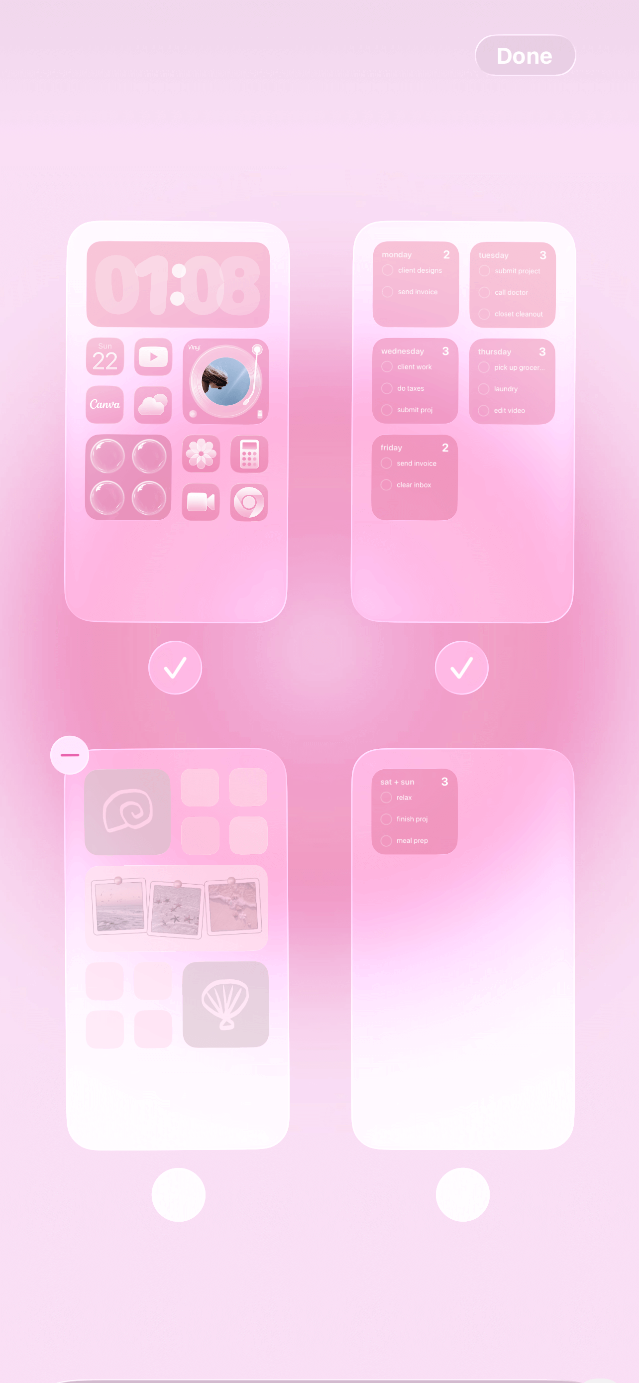
If you have more than three home screen pages, it’s time to simplify. The more you scroll, the more scattered your layout (and your brain) becomes. A minimalist iPhone setup usually works best with one to three intentional pages. You can even assign a theme to each page the way you would with folders.
#12: The Wallpaper Simplicity Rule
Typically, busy wallpapers compete with your icons and widgets. A clean, soft, or lightly textured wallpaper enhances your layout rather than distracting from it. I love a cute pattern every now and then but for the most part, I opt to keep my wallpapers on the simple side.
Related: How To Customize Your iPhone With iOS 26 (Aesthetic Pink Aura Theme + Tutorial!)
#13: The Habit Support Rule
We love a cute layout, but don’t forget about practicality. Place apps based on your habits, not aesthetics alone. If you want to journal more, move your journaling app somewhere visible. If you want to scroll less, remove social apps from your first page. A clean layout should support your lifestyle and your habits.
Closing Thoughts
When your home screen is organized, your digital space feels lighter. And when your digital space feels lighter, your mind usually does too!
Your home screen is something you see dozens of times a day. It should feel peaceful, not overwhelming. And honestly, that little shift can make a bigger difference than you think.
Thanks for stopping by my post “13 iPhone Rules To Fix Your Chaotic Phone (And Make It Aesthetic).”
For handmade digital art prints, icon packs, wallpapers, & more designed by me, be sure to stop by my digital boutique: Designed By Nikki Lo.
Connect with me!